A population pyramid graphically illustrates the age and gender Gender Gender Dysphoria distribution of a given population. The shape of the pyramid conveys details about life expectancy, birth, fertility, and mortality Mortality All deaths reported in a given population. Measures of Health Status rates. Additional data that can be extrapolated from a population pyramid include the effects of historical events, economic development, and future demographic trends. This information helps direct plans for the subsequent social and economic needs of a given population.
Last updated: Oct 30, 2024
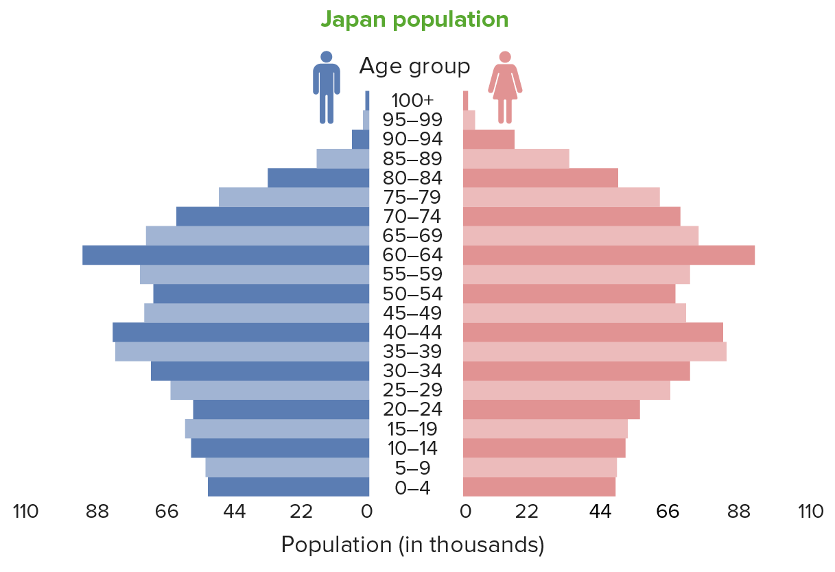
Population pyramid of Japan: The bulk of the population is in the 45–70-year age group. A low birth rate is exhibited by the tapering bottom of the graph.
Image by Lecturio.
Population pyramid of Bahrain: The pyramid shows that there are more males than females, with the majority of the population in the 25–45-year age group. This increase in the male population reflects the effect of labor migration.
Image by Lecturio.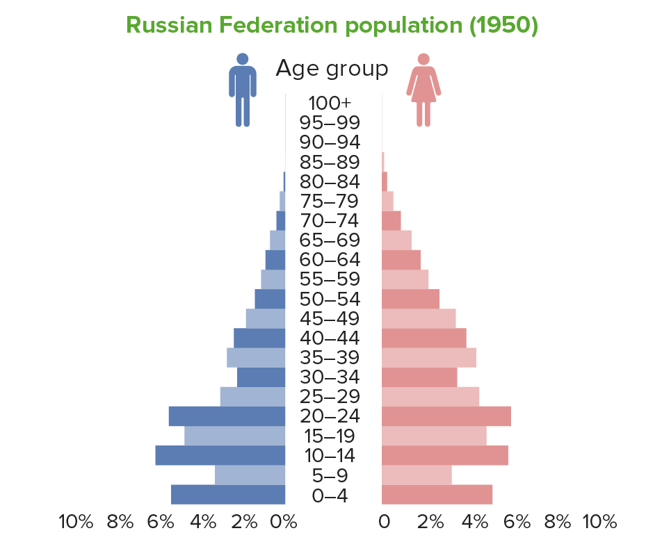
1950 Population pyramid of the Russian Federation. Note the kinks or indents for ages 5–9 years showing the low-birth-rate effects of World War II in the years prior. Another consequence is the lower-than-expected number of men aged 20–50 years in that period.
Image by Lecturio.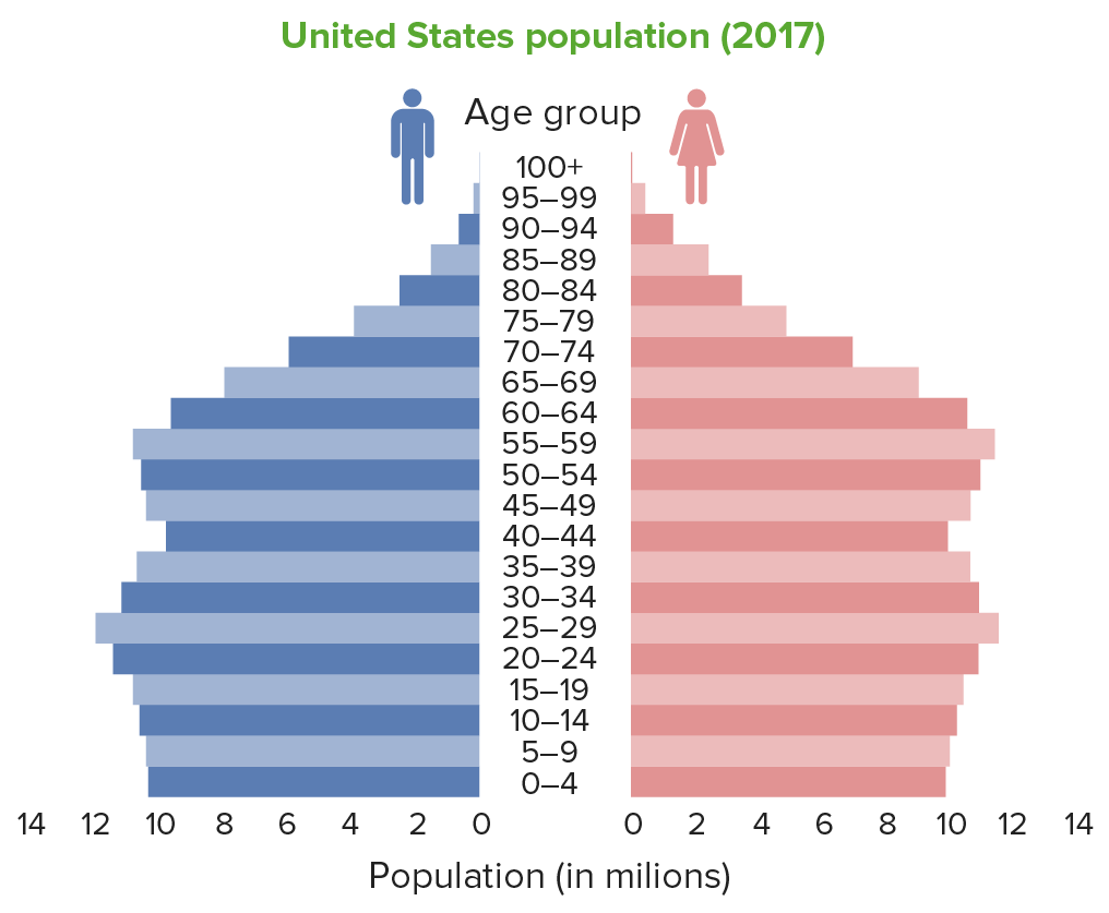
Stationary population pyramid (United States) in 2017, showing even bars indicating that most age groups are almost equal in size
Image by Lecturio.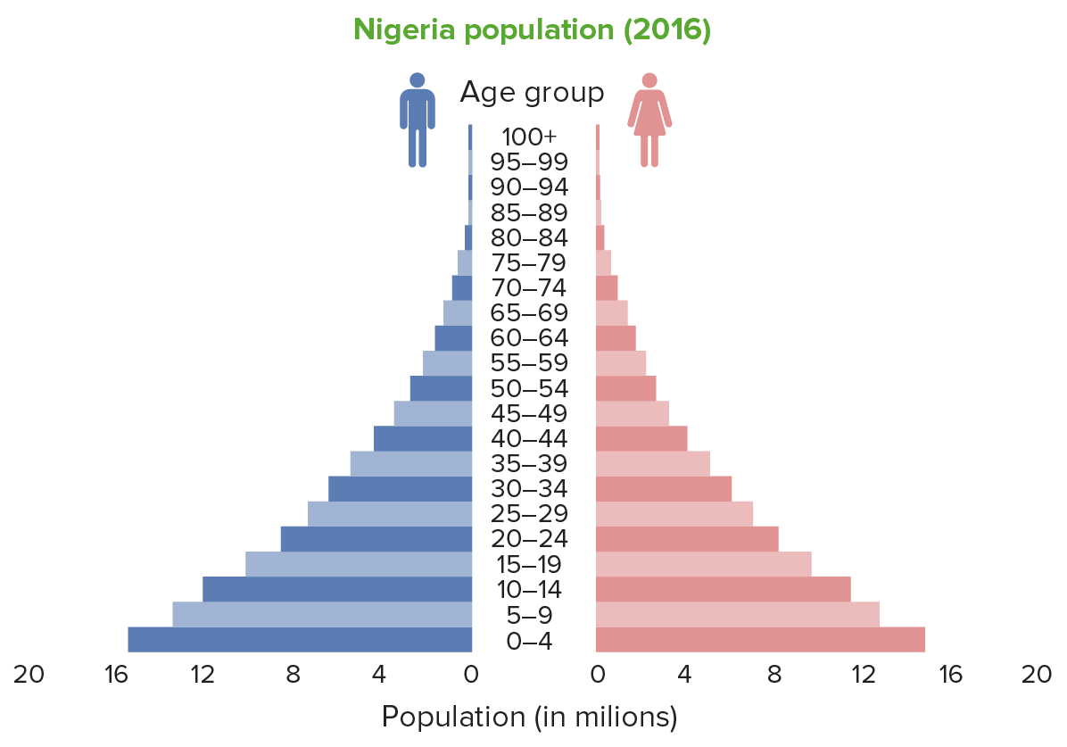
Expansive population pyramid (Nigeria): Note the wide base, which is indicative of a high fertility rate.
Image by Lecturio.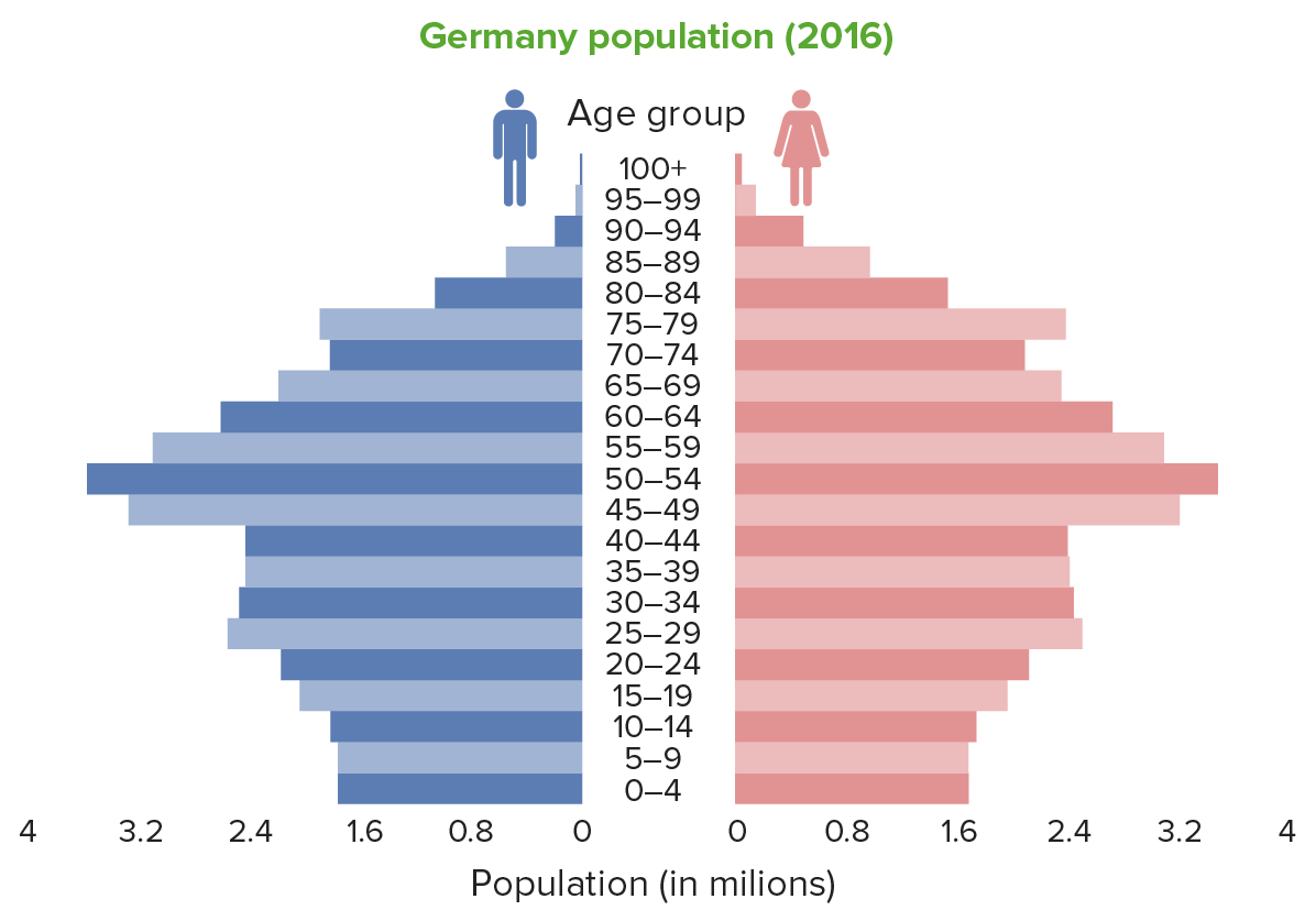
Constrictive population pyramid (Germany), showing a narrow base, indicating a low birth rate
Image by Lecturio.Stage 1 Stage 1 Trypanosoma brucei/African trypanosomiasis: high stationary
Stage 2: early expanding
Stage 3: late expanding
Stage 4: low stationary
Stage 5:
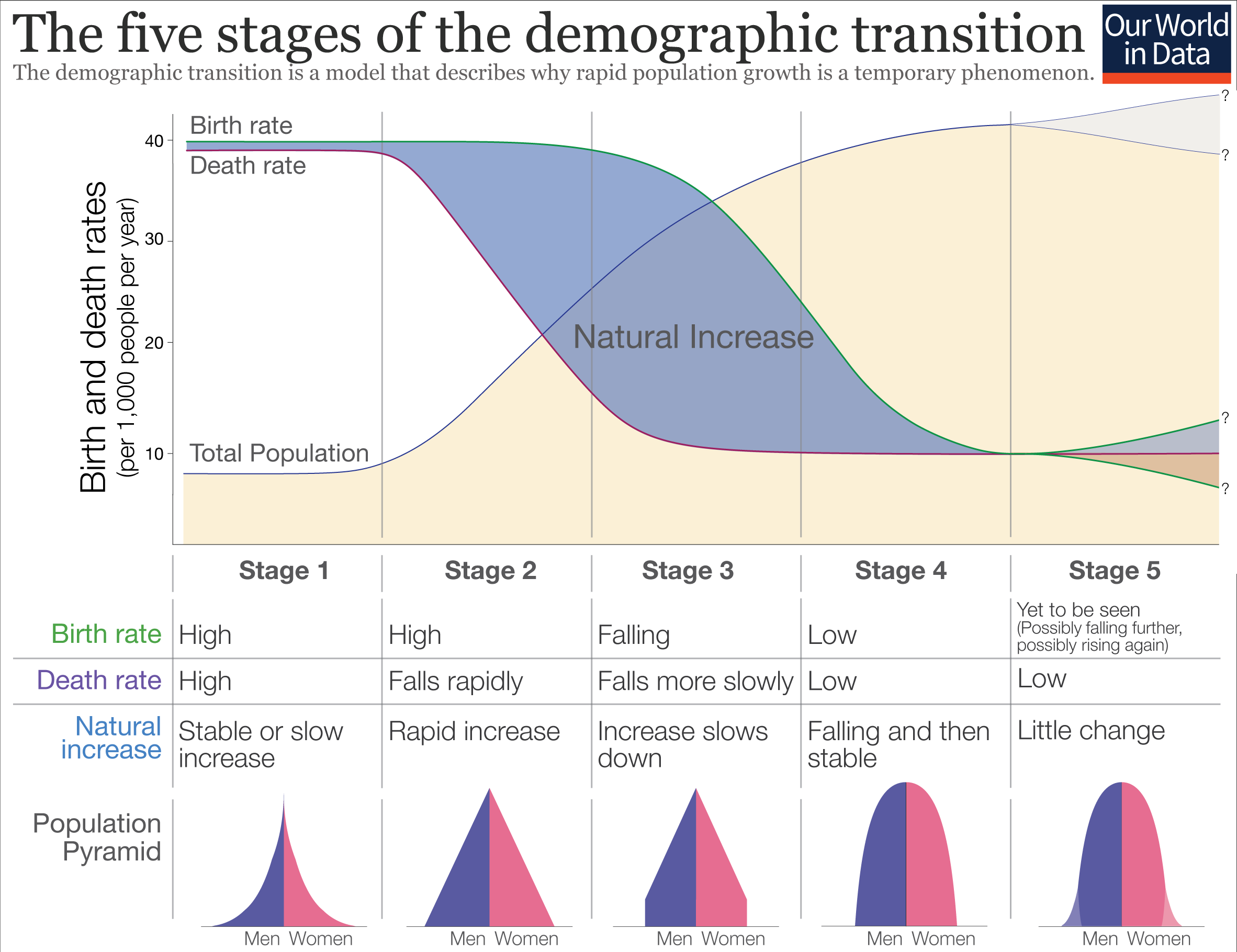
Image illustrating stages of demographic transition, with the upper graph showing an increase in population with a falling death rate. Lower illustration shows the trend of population pyramids. The birth and death rates change through different stages in the model. As the population experiences prosperity and modernization, both birth and mortality rates fall. At stage 4, the population is stable but the growth rate is declining. Stage 5 is noted in a few nations, but is yet to be seen in most countries.
Image: “Five stages of the demographic transition” by Our World in Data. License: CC BY 4.0