Playlist
Show Playlist
Hide Playlist
Summarizing Quantitative Variables

-
Slides Statistics pt1 Summarizing Quantitative Variables.pdf
-
Download Lecture Overview
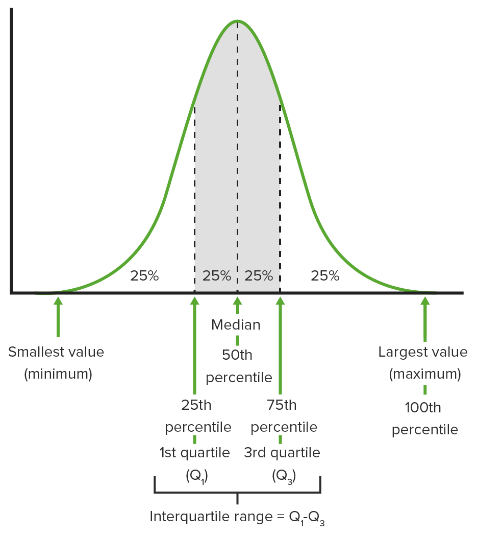
00:01 Welcome to Lecture 3, where we're gonna discuss Summarizing Quantitative Variables. 00:05 We often use graphical displays to summarize the distribution of a quantitative variable, but first, we need to recall what a quantitative variable is. 00:14 So remember that a quantitative variable is a variable whose value have some numerical meaning. 00:20 And we have several different types of graphs and charts that we use to display the distribution of a quantitative variable. 00:27 We use histograms, steam-and-leaf plots, box plots, and now we're gonna look at some of these types of graphs. 00:36 The histogram gives us a good idea of what the shape of the distribution of a quantitative variable is. 00:42 So when we make a histogram, it's basically the quantitative counterpart to the categorical bar chart. 00:49 What we do is we slice up all the possible values, the whole range of possible values for a quantitative variable into equal-width intervals, which we call bins. 01:00 We count the number of observations that fall into each bin. 01:04 And we make a bar whose height corresponds to the number of observations that fall into that bin. 01:10 And once we've done this, we've created what we call a histogram. 01:14 So here's an example just for a fake data set. 01:18 Suppose we have the following measurements for a quantitative variable. 01:22 And there they are, in that first bullet. What we've done on the right-hand side of the screen, is we've made a histogram of these data values. 01:31 So what does the histogram tell us? Well, the histogram tells us that we have one value that lies between 10 and 14. 01:41 We have 6 values that are between 16 and 20, 14 that are between 21 and 25, and 4 that fall between 26 and 30. 01:51 And looking at the data, if we just try to check that out for ourselves, the data would verify that. 01:58 One important thing to notice that's different between a bar chart and a histogram, is that there are no gaps between the bars of a histogram. 02:06 Sometimes we have quantitative data that can take any value in a particular range, say 25 to 30. 02:13 And so, we need to be able to include values such as 25.99 and 29.9745, for example. 02:19 So we have to have no gaps between the bars. 02:23 We can also represent quantitative variables using a relative frequency histogram. 02:29 And this is the same thing as a histogram, except now we're displaying counts as percentages of the whole. 02:36 This is the same ideas we used before with the relative frequency bar chart. 02:41 So here's the relative frequency histogram for the data set that we just looked at, and note that it looks the same except the values on the Y-axis are all percentages or proportions, and not frequencies. 02:57 Now, we look at stem-and-leaf plots, which are a lot like histograms, but they show all of the data values. 03:04 So how do histograms and stem-and-leaf plots differ? Well, histogram summarize our quantitative data well, but they don't actually give the actual values of the data. 03:15 Stem-and-leaf plots do show the individual values. 03:19 So what we do is we put the first number on the left-hand side, we draw a vertical line, and then we put the second numbers on the right-hand side of the line. 03:28 So here's an example for our data, we have 1, 1, 2, 2 down the left side which represents 10, 10, 20, 20. 03:36 And then we have the ones digits on the right-hand side of the line. 03:41 So 1 line 2 is 12, 1 line 6 is 16, 1 line 7 is 17, and so forth. 03:49 How are stem-and-leaf plots similar to histograms? Well, if we look at the stem-and-leaf plot, and we flip it just to the left 90 degrees. 03:59 What we would get is something that looks a lot like our histogram. 04:02 Stem-and-leaf plots have two big advantages over histograms. 04:07 First off, they're easier to make by hand. 04:10 And second, they still show the distribution of a quantitative variable. 04:14 But one problem that we run into in stem-and-leaf plots is that if we have a large number of observations, the creation of a stem-and-leaf plot can take a lot of time. 04:24 Often, when we look at quantitative variables, we look at certain characteristics of their distribution. 04:31 The first thing that we typically look for is the shape of the distribution. 04:35 For instance, is it symmetric? And what that means is if you made a histogram can you fold the histogram along the vertical line through the middle, and have the sides match pretty closely? Is it skewed to the right? In other words, is there a large cluster of data on the left-hand side with long tail going out to the right? Is it skewed left, where there's a large cluster of data out to the right, and then there's a tail that comes out to the left? We also, when we talk about shape, we look at the number of modes. 05:07 We ask how many peaks are in the histogram. 05:11 So if there's just one peak, we say that it's unimodal. 05:13 If there are two peaks, or two modes, we call it bimodal. 05:17 And then we get a little lazy after that, and if there are more than two modes, we just call it multimodal. 05:23 Alright, so let's look at the previous example, where we made the histogram, and try to describe the shape of the distribution based on the new information that we have. 05:32 Is it symmetric? Well, it doesn't look like it is, in fact, it appears to be a lot of data out to the right-hand side with a thin tail to the left. 05:42 So this distribution be skewed to the left. 05:45 How many modes do we have? Well, it appears that there is one peak, and it's between -- in a bar between 20 and 25, so the distribution does appear to be unimodal. 05:56 Here's just a picture of what a right-skewed distribution looks like. 06:00 Note that we have a whole bunch of data on the left-hand side, and then a thin tail going out to the right. 06:05 Here's an example of what a symmetric distribution looks like. 06:09 We could fold, we could draw a line right between -- right down the middle of the bar between 6 and 8, and then fold it in half, and it would -- the sides would match exactly, so this is a symmetric distribution. 06:22 And here's what a bimodal distribution, we have one peak -- looks like we have one peak to the left and one peak to the right, and then a little value in the middle. 06:31 So we have two modes there. And we would say that this distribution is bimodal. 06:35 So the second thing that we look for when we try to characterize the quantitative distribution, is where it's centered. Where is this distribution located? And one measure that we typically use just to answer this question is the median. 06:50 So how do we find the median? Well, in order to find the median, what we do is we put -- we sort all of our data from lowest to highest, and then we pick out the value that falls in the middle. 07:01 If we have an odd number of observations, then we just pick the one in the middle. 07:08 If we have a total of n observations, then we just take n plus 1 over 2 observation once they're all sorted. 07:15 If our sample size is even, then we just take the average of the two values in the middle. 07:23 So the sample size over two, and the sample size over two plus one. 07:28 We take those two observations and average them together, and that gives us our median when we have an even number of observations. 07:35 So let's look at an example, where we do the -- we use the same data set that we used to create our histogram. 07:42 We have 25 observations, so it's odd, and we just pick out the one in the middle. 07:47 So the one that we look at once we sort everything out, is the 13th observation, 25 plus 1 over two. 07:53 Our 13th order observation is 22. So the median of our data set is 22. 08:01 The third thing that we look for is the spread. 08:05 How spread out are the values in our sample? In other words, how much do our observations vary? One way to do this is to look at the range where we take the largest observation minus the smallest observation. 08:20 However, there's a problem with doing this, because if we -- if we have extreme values, then we can really have a big range, but our data might not actually be spread out that far. 08:33 For instance, in our original data set, if we entered 299 instead of 29, then our data -- our range would go from 29 minus 12 which is 17, all the way up to 287, 299 minus 12. So the range is highly sensitive to extreme values. 08:57 So it's not necessarily the best measure of spread to use. 09:00 So we can improve on that, instead of looking at the extreme values of our sample, we take the ones in the middle, and we look at the range between those middle values. 09:11 So what do we mean by that? Well, we divide the data -- the ordered data in half at the median, and then we look at the median of the lower half and the median of the upper half. 09:24 And in finding the median for each half, we don't include the overall median. 09:30 So then, what we have is 1/4 of the data line below the median of the lower half, which we call the lower quartile. 09:39 We have 1/4 of the data lying above the upper -- the median of the upper half, or the upper quartile. 09:48 And that means that half of the data fall between those two values. 09:53 So when we define the interquartile range, what we mean is the upper quartile minus the lower quartile. 10:00 So it's the -- basically the range of the middle 50% of our data. 10:05 So let's look at an example using the data set that we had from before. 10:10 If we look at the lower half of our data set, excluding the median, we have 12 observations. 10:18 So we look at the average of the 6th and 7th values. 10:21 So our lower quartile is 1/2 times 19 plus 20, or 19.5. 10:29 If we look at the upper half of our data, while excluding the median, then what we have -- we also have 12 observations there, so the median, is again, the average of the 6th and 7th values. 10:41 And when we average those two together, we get an upper quartile of 25. 10:46 So our interquartile range then, is 25 minus 19.5, or 5.5. 10:53 Now note that if we had -- if we miss any of the maximum value -- if we miss any or 29, it wouldn't affect the interquartile range. 11:03 So this is a lot less sensitive to extreme values than what the range is. 11:07 We use all the values that we've just found to calculate what's known as a five number summary, and this is basically a concise description of the spread and center. 11:17 So we summarize our data set with five numbers. 11:19 The minimum or the lowest observation, the lower quartile or Q1, the median, the upper quartile or q3, and the maximum. 11:32 And these values are what's used to make what we call a box plot of our data set. 11:37 So this is another way to summarize data graphically. 11:41 And so we display the five-number summary with a box plot. 11:44 And here are the steps to do it. 11:46 Okay, so we draw a single vertical axis that spans the entire range of the data. 11:50 And then we draw a horizontal lines at the lower and upper quartiles. 11:55 And then we draw a vertical lines connecting those -- those horizontal lines to make a box. 12:00 So there's a box that has exactly the interquartile range as its width. 12:05 Inside that box, we draw a line to represent the median, and then we make fences around the data. 12:15 Our upper fence is the upper quartile plus 1.5 times the interquartile range. 12:21 And the lower fence is the lower quartile minus 1.5 times the interquartile range. 12:27 But for now, we're not gonna include those fences in our boxplot, we'll talk about that a little bit later. 12:32 So once we have the box, we grew whiskers out of it, one going up and one going down. 12:37 So one whisker connects the upper edge of the box to the maximum value, the other whisker connects the lower edge of the box to the minimum value. 12:46 If a data point falls below the lower fence that we calculated, then we connect the whisker to a horizontal line from the lower quartile that marks the lower fence. 12:57 And any points that fall below that are marked with dots. 13:01 If a data point falls above the upper fence, then we connect the upper whisker from the upper quartile to a horizontal line that marks the upper fence, and any points above that upper fence are also marked with dots. 13:17 So here's an example of a boxplot. We first give the five-number summary. 13:21 The minimum is 12, Q1, we found was 19.5. We found the median to be 22, the third quartile to be 25, and the maximum to be 29. 13:32 The interquartile range is 5.5, we found that earlier. 13:37 And so the fences are 19.5 minus 1.5 times 5.5, which is 11.25. 13:44 So we don't have any data points below our lower fence. 13:48 For our upper fence, we get 33.25, and we don't have any values that fall above that upper fence. 13:55 So we don't have any extreme values that we need to mark with dots. 13:59 All right. Now sometimes, we have symmetric distributions, and we can summarize those a little bit differently. 14:07 Now, the median is going to work well to summarize the center of a distribution, regardless of the shape. But some -- we have a couple of things that have some nice properties that we can use to summarize symmetric distributions. 14:19 If the distribution is symmetric, we can summarize the center using the mean, or the average value of our observations. 14:27 Supposed our data values are Y1 through Yn, then the mean is given by just adding up all of our data values, and dividing by the total sample size. 14:37 And this gives an idea of basically where the histogram would balance, where there would be equal weight on both sides of the mean. 14:46 We don't wanna use the mean to summarize skew distributions, because the mean is really sensitive to extreme values, and to skewness. 14:53 Like that lower -- that tail is gonna pull the mean in its direction. 14:58 We can also summarize the spread differently for a symmetric distribution. 15:03 And we summarize this using what's called the standard deviation. 15:07 So we start by finding what's called a variance. 15:10 And to find the variance, what we do is we take each observation, subtract the mean, and square that difference. And once we do that we add them all up, and we divide them by 1 over our sample size minus 1. 15:27 This gives us what's known as the variance of our sample. 15:31 And then more commonly, we use the standard deviation to summarize spread, and we take -- we get the standard deviation simply by taking the square root of the variance that we just found. 15:43 So for example, we use the data set that we've already had, and we calculate the mean. 15:49 We take 1/25, which is our sample size, times the sum of all of our observations, and we get 22 as our mean. 15:57 To get our standard deviation, we take the square root of the sum of each observation, minus 22-squared, divided by the sample size minus 1. 16:08 So we get the standard deviation of 3.9791, and this basically represents the average distance of an observation from the mean. 16:17 And for symmetric distributions this provides a useful numerical summary of the center and spread of the data. 16:23 So let's summarize how we describe quantitative variables. 16:28 The important things to remember are first, when describing a quantitative variable, you wanna be sure to include a description of the shape, the center, and the spread of the distribution of that variable. 16:40 For symmetric distributions, you can use the mean and the standard deviation as your measures of center and spread. 16:47 But if your distribution is not symmetric, then you wanna go with the median, and the interquartile range to summarize the center and spread. 16:55 If the distribution is skewed, then the mean is skewed to the right -- then the mean will be larger than the median, because the tail -- you wanna remember that the mean chases the tail, so whichever direction the tail goes, that's the direction the mean is gonna go. 17:11 If the distribution is skewed left then, the mean will be smaller than the median, because the tail is gonna pull the mean down towards it. 17:20 And in a symmetric distribution, the mean and the median should be pretty close to equal. 17:24 So let's think about some common issues to avoid. 17:28 Some things that can go wrong, and some common mistakes that are made in the description of the distribution of a quantitative variable. 17:35 We don't wanna make histograms of categorical variables. 17:38 We wanna remember to sort the data before we find the median and the quartiles. 17:45 We wanna remember three rules of summarizing quantitative data. 17:49 And these three rules are, one, make a picture, two, make a picture, and three, make a picture. 17:56 Graphs gives us a lot of information -- a lot of useful information in one place about the distribution of a quantitative variable. 18:03 It's a useful way to get some sense of how the quantitative variable is distributed in the sample. 18:10 We wanna make sure that when we summarize center and spread, we do it in the proper way, and by the proper way, that means what we know about the shape. 18:18 So we need to know the shape, whether it's skewed, and if it is skewed, remember to use the median and the interquartile range. 18:25 If it's symmetric, then you remember to use the mean and the standard deviation to summarize the center and the spread. 18:31 And those are the common issues that we run into when we describe the distributions of quantitative variables. 18:37 And that's the end of Lecture 3, and we'll see you back here for Lecture 4.
About the Lecture
The lecture Summarizing Quantitative Variables by David Spade, PhD is from the course Statistics Part 1. It contains the following chapters:
- Summarizing Quantitative Variables
- Stem and Leaf Plots
- Shape of a Distribution
- Interquartile Range
- Example: Making a Boxplot
- How we describe Quantitative Variables
Included Quiz Questions
Which of the following graphical displays can be used to summarize the distribution of a quantitative variable?
- A histogram can be used to summarize the distribution of a quantitative variable.
- A bar chart can be used to summarize the distribution of a quantitative variable.
- A contingency table can be used to summarize the distribution of a quantitative variable.
- A pie chart can be used to summarize the distribution of a quantitative variable.
- A Venn diagram can be used to summarize the distribution of a quantitive variable.
What is a characteristic to evaluate when assessing a distribution?
- The spread of the distribution
- The weight of the distribution
- The beta of the distribution
- The kappa agreement of the distribution
- The age of the distribution
Which of the following is not true about a box plot?
- The upper whisker of a box plot always ends at the maximum, and the lower whisker of a box plot always ends at the minimum.
- The width of the box gives the interquartile range.
- The line in the middle of the box gives the value of the median.
- A box plot hides the number of modes in the distribution.
How do we typically describe a symmetric distribution?
- We typically use the mean and the standard deviation to describe the center and spread of a symmetric distribution.
- We typically use the five-number summary to describe a symmetric distribution.
- We typically use the median and the interquartile range to describe the center and spread of a symmetric distribution.
- We typically use the median and the range to describe the center and spread of a symmetric distribution.
- We typically use the mode and the range to describe the center and spread of a symmetric distribution.
What is the term used for a histogram with 3 modes?
- Multimodal
- Unimodal
- Bimodal
- Nomodal
- Infinitymodal
What is the median for the following data set: 12, 16, 17, 19, 23?
- 17
- 12
- 16
- 19
- 23
What is the median for the following data set: 12, 16, 17, 19?
- 16.5
- 12
- 16
- 17
- 19
What is the median for the following data set: 15, 17, 17, 12, 8, 18, 2?
- 15
- 17
- 12
- 8
- 18
What is the range of the following data set: 12, 16, 17, 19, 23?
- 11
- 10
- 12
- 13
- 14
Author of lecture Summarizing Quantitative Variables

David Spade, PhD
Customer reviews
3,4 of 5 stars
| 5 Stars |
|
2 |
| 4 Stars |
|
1 |
| 3 Stars |
|
0 |
| 2 Stars |
|
1 |
| 1 Star |
|
1 |
The explanation is smooth and clear. However, I think it would have been better if the common sense behind the formulas (especially the standard deviation) was explained in more detail so we can understand how the formulas work a little more deeply.
Its Pretty confusing. Ofc I am a person I ve never had any experience with statitics but during the lecture is so easy to lose pace. Lecture number 1 was easier to get because of the Age-Education as paradigm instead of soulless numbers.! In addition its really confusing when the examples are made with data from the previous slide, witch you dont see any more but you require it to proceed.
He is explaining great ! Little bit fast sometimes, but it is first time that i understand statistics.
Dr. Spade has a very practical way of explaining these concepts, without confusion. Much detail is provided and the process is smooth. Thanks Doc.
