Playlist
Show Playlist
Hide Playlist
Standardizing Data and the Normal Distribution Part 1

-
Slides Statistics pt1 Standardizing Data and Normal Distribution pt1.pdf
-
Download Lecture Overview
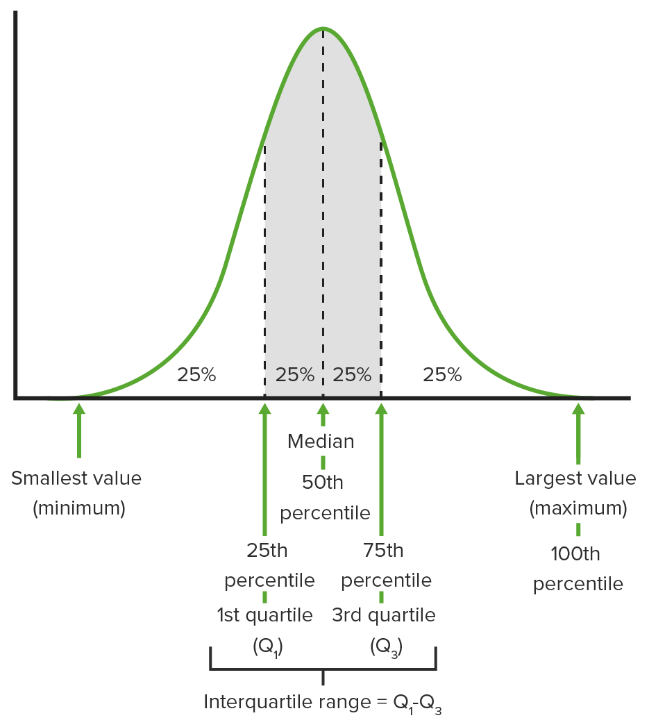
00:00 Welcome to Lecture 5. 00:02 Where we're going to discuss Standardizing Data and the Normal Distribution. 00:06 When we standardize data, we use what’s called a z-score and so, let’s learn about these by an example. 00:12 One question we might wanna know is which is better, a total score of 2000 on the SAT or a total score of 32 on the ACT? Since the scales are different, it wouldn’t make sense to compare these scores based on points. 00:28 For instance, we can’t say that the 2000 on the SAT is better than a 32 on ACT just because the number of points is higher. 00:36 What we can do is we can use the standard deviations for the SAT scores and for the ACT scores as units of measure for each test and compare the scores in this way. 00:49 When we standardize data, we’re often interested in knowing how many standard deviations each observation is away from its mean? How can we figure out how many standard deviations away each test score is from its mean? Well, let’s suppose that the mean SAT score is 1,500, and that the standard deviation for SAT scores is 200. 01:12 Let’s also suppose that the mean ACT score is 24 and that the standard deviation of the ACT scores is 2. So, which is better? Well, let’s compute what’s known as a z-score which measures how many standard deviations away from its mean and observation is. 01:29 We find it by taking the observation minus its mean and dividing by the standard deviation. 01:34 So for the SAT score of 2000, the z-score is 2000, minus the mean of 1,500, divided by 200, which gives us 2.5, so 2,000 is 2.5 standard deviations above the mean SAT score. 01:51 For the ACT score of 32, the z-score is 32, minus the mean of 24, divided by the standard deviation of 2, which gives us a z-score of 4. 02:03 If 32 is 4 standard deviations higher than the average ACT score. 02:08 Because the ACT score is 4 standard deviations higher than the average and the SAT score is 2.5 standard deviations higher than the average, then we say that the ACT score is better than SAT score of 2,000. 02:25 Standardizing data enables us to make these types of comparisons between observations whose measurement are on different scales. 02:32 Let’s discuss shifting data, where we move all the data values in one direction. 02:39 Formally, a shift of a set of observations means that the same constant has been added to or subtracted from each observation in our data set. 02:48 When a set of data are shifted, the measures of center and location such as the mean, median and the quartiles end up having the same constant added to or subtracted from each of them. 03:00 The shape of the distribution doesn’t change. 03:03 A histogram of shifted data would simply give the appearance of the graph having been picked up and moved someplace else. 03:11 And so, let’s look on an example of what histograms look like when we shift the data set. 03:15 Supposed we have the data set that you see in green, but lower histogram on the left hand-side is a histogram of the data set as it originally appears, where we have a bimodal distribution centered right around 30 or 35. 03:29 What if we shift the data set down by 10, which means we subtract 10 from every observation? Then if you notice the shape of the histogram is exactly the same on the right as it is on the left, but if you look at the values on the x-axis, what you see is that the center is now around between 20 and 25 instead of between 30 and 35. 03:52 The center of that distribution has been shifted down also by 10 units. 03:56 Alright. What we can see from the two histograms is that the left histogram and the right histogram look exactly the same, except for the fact that the values on the x-axis are different. 04:06 The histogram has been pick up and moved to the left by 10 units. 04:10 The shape is unaffected. If we look at the quartiles and the median, and the mean for the original data set, what we find is that the mean is 32.115, the median is 31, the first quartile is 27.25 and the third quartile was 38. 04:27 After the shift, we would find that the mean is 22.115, the median is 21 and the quartiles are 17.25 and 28. 04:38 All of these measures in our shifted data set are lower than the corresponding measures in the original data set by exactly 10, and that’s exactly what happens anytime we shift the data set. 04:49 What’s the moral of the story? Well, the big picture is that if we shift the data set by a given constant, this result to no change whatsoever to the shape of the histogram. 04:57 However, all the measures of center and location will be shifted by that same constant. 05:03 What happens to the measure of spread? While in the original data set, the standard deviation can be found to be 6.1144 and the inner quartile range can be found to be 10.75. 05:16 In the shifted data set, we would also find that the standard deviation is 6.1144 and the inner quartile range is still 10.75, so the take-away there is that a shift by a given constant changes the measures of center and location but has no effect whatsoever on the measures of spread, and this makes sense given what we saw on the histogram because they look exactly the same - one wasn’t anymore spread out than the other so it makes intuitive sense that the measures of spread should not be affected by a shift. 05:50 What about rescaling data, where we change the scale of a data? Formally with the rescaling of a data set, it is the multiplication or division of every observation in that data set by a given constant. 06:02 A rescaling of a data set has the following effects: it changes the overall -- the overall shape of the histogram does not change, but the measures of center and location are all multiplied or divided by their constant, and the measures of spread are also all multiplied or divided by the constant. 06:19 Alright. Now, let’s look on an example of what happens when we multiply each observation in our data set by 1/2. 06:26 Well, here’s the histogram on the left hand-side of the original data set and now look what happens on the right. 06:33 The shape of histogram looks exactly the same as it did before, however if you look at the values on the x-axis, they’re not as spread out. 06:42 They go from 10 to 22 as opposed to 20 to 45, so the spread has decreased by a factor of 1/2. 06:51 When we look at the effect of rescaling data, we note that the shape of the histogram doesn’t change and that the distribution, in this case, is less spread out than what it was previously. 07:03 It is less spread out by a factor of 1/2 because we multiplied everything by 1/2. 07:08 The distribution appears to be centered at the value that’s about 1/2 of the center of the distribution in the original data set, and we can verify the last two statements using summary statistics, so let’s do that. 07:20 Recall that for the original data set, we had a mean of 32.12, a median of 31, first quartile of 27.25, third quartile of 38, and an inner quartile range of 10.75, along with the standard deviation of 6.11. 07:37 For the rescaled data, we find that the mean is 16.06, the median is 15.5, the first quartile was 13.625, the third quartile was 19, the inner quartile ranges 5.375, and the standard deviation is 3.0572. 07:56 So, what happened? Well, the summary statistics show us that the measures of location and center, as well as the measures of spread, changed by exactly a factor of 1/2, when we rescale the data. 08:09 This is the point of shifting and rescaling our data when we standardize. 08:12 We can get two data sets on the same scale by making sure that both have the same mean and standard deviation. 08:19 Let’s revisit z-scores and see what happens. 08:23 Suppose that for each data value in a given data set, we subtract the sample mean y bar, then the sample mean of the shifted data points yi minus y bar is 0. 08:34 The sample standard deviation s does not change, but now we divide everything. 08:40 We now divide those shifted data points by the sample standard deviation, and what happens? Well, instead of shifted and rescaled data points now has mean 0 and standard deviation 1. 08:52 This is why the use of z-scores enables us to make comparisons between groups. 08:57 It puts every set of observations on the same scale. 09:01 All right, so let’s look at an example. Where we standardize our original data set. 09:05 We take our data, we subtract the sample mean and we divide it by the sample standard deviation. 09:11 Here’s the histogram. What happens? Well, it appears to be centered around 0 and the standard deviation is a little bit more difficult to evaluate visually, but we can find that the mean and standard deviation for the standardized data are in fact 0 and 1, respectively. 09:28 The standardization of our data has resulted in the data set now having a mean of 0 and a standard deviation of 1, as is what we expected. How do we make sense of z-score? In other words, what does it mean - what is a large z-score? What’s a small z-score? Well, if our data are symmetric, then typically at least half of our z-scores fall between -1 and 1, but this is not really a universal standard for figuring this out. 09:55 Typically, z-scores larger than 3 or smaller than -3 are fairly uncommon especially in symmetric distributions, but z-scores of 6 or 7 or -6 or -7 are exceedingly rare in pretty much any situation, so these can be regarded as large. 10:12 Z-scores aren’t always useful for doing much more than comparing variables on different scales but sometimes, we can do a lot more with them, so let’s look at some of the things that we can do with z-scores. 10:22 Z-scores are at the heart of making use of what we know as a normal distribution, or the often refer to bell-shaped curve, and what the normal distribution does is it’s a good approximation to distributions that are unimodal and fairly symmetric. 10:37 We write normal with µ (mu) and standard deviation (sigma) with a notation that you see in bold there and with mu and sigma in parenthesis. 10:49 Note mu and sigma do not come from the data. 10:53 These are numbers that we choose to help specify the model. 10:56 These are called parameters of the model and we cannot get them from the data. 11:00 The values y bar and s, the sample mean and sample standard deviation are the values that come from the data. This are called statistics. 11:10 Just to summarize, parameters are things that do not come from the data they're basically values that correspond to the population. 11:19 Statistics are values that we calculate from the sample to try to summarize the data. 11:25 Let’s look more at the normal distribution. 11:28 If we can summarize the data using a normal distribution, then we can standardize them using the mean and standard deviation, so this means that we calculate z-scores based on these parameters and we standardize our data values in the way that we take the z-scores for each data value is yi minus mu divided by sigma for each data value, and the standardize data can then be viewed as following a normal distribution with mean 0 and standard deviation 1. 11:57 We have to use some caution when we use the normal distribution. It’s a not cure-all. 12:03 We can’t use the normal distribution to describe just any data set. 12:07 If the data set is not already unimodal and symmetric, then standardizing it will not make it normal. 12:14 We have to verify the nearly normal condition, but what do we mean by that? Well, basically when we look at the nearly normal condition, what we want is that the shape of the data’s distribution is unimodal and roughly symmetric. 12:26 We can check this with the histogram, which we already know about, or we can check it with what’s called a normal probability plot, which we’ll discuss a little bit later. 12:35 Under the normal distribution, we have a useful rule: It’s called the Empirical Rule or also know as the 68-95-99.7 rule, and what this states is that under the normal distribution, about 68% of the values fall between -1 and 1 standard deviations from the mean, about 95% of values fall within 2 standard deviations of the mean, and about 99.7% of values fall within 3 standard deviations of the mean. 13:06 All right, so in terms of the picture, about 68% of the values fall in the center region, about 95% of the values fall in the center region, plus the 2 adjacent regions on either side, and about 99.7% of the values fall within the region covered by the entire shaded area. 13:26 All right. For example, let’s assume that the SAT scores are normally distributed, and remember that the mean score is 1,500 and the standard deviation is 200. 13:37 Then, about 68% of the scores fall between 1,300 and 1,700 within 1 standard deviation of 1,500. 13:45 About 95% of the scores fall between 1,100 and 1,900, which is within 2 standard deviations of the mean, and about 99.7% of the scores fall between 900 and 2,100 or within 3 standard deviations of the mean score. 14:00 Now, how do we find probabilities under the normal distribution? Well, we can use the Empirical rule in some cases. 14:09 The Empirical rule is useful for finding probabilities that are or percentage of observations are above or below a particular value, as long as the z-score has a value of 1, 2, 3 or -1,-2, or -3. 14:22 For example, what percentage of SAT scores are between 1,300 and 1,900? Well, by the empirical rule, the z-score for 1,300 is -1, so about 16% of people scored less than 1,300. 14:39 The z-score for 1,900 is 2 so by the empirical rule, about 2.5% of people scored above 1,900. 14:47 Therefore, 18.5% of people scored either below 1,300 or above 1,900, but what we want is that area in between. 14:57 We want that probability area of that percentage in between 1,300 and 1,900, so we have to subtract that percentage from 100%, and so we find that 81.5% of people scored between 1,300 and 1,900. 15:11 Now, what percentage of SAT takers scored below 1,400? Well, we find the z-score for 1,400 and we get -0.5. 15:22 Now, we might be in trouble if we wanna use the empirical rules because the z-score’s not covered by that. 15:28 Remember that the empirical rule only covers z-scores of -1, 1, -2, 2,-3 and 3. 15:34 -0.5 is not covered by this, but we have a table that we can use to figure these types of things out. 15:40 Sometimes we have z-scores that aren’t covered by the empirical rule, but we have a table that’s gonna be presented in the next slide that gives you probabilities for z-scores that aren’t covered by the empirical rule. 15:53 What is that table give you? Well in the body of the table are percentages, and in the margins of the table you can find a z-score, and so once you find the z-score and match it up with the percentage in the body of the table, then what that percentage represents is the percentage of values that are gonna be less than or equal to that particular z-score. 16:15 Here’s the picture of the table and we’ll revisit this in a few minutes. 16:21 But how do we use it? Well, let’s start with when the z-score is positive because that’s the easy case. 16:28 What we do is go to the left margin, and we find the ones and tenths digits corresponding to the z-score, and then we’ll find the hundredths digit in the top margin. 16:38 Once we do that, we match up the cell and the body of the table that corresponds to both of those and that’s how it gives the percentage of observations that are less than or equal to what the z-score is. 16:51 Subtracting this value from 100% gives you the percentage of the observations that are greater than or equal to the z-score that you’re interested in. 17:01 What if the z-score is negative? Well, what we can do is we can find the positive value in the z-score in the margins of the table, so for instance, z is -1.04, look up z = 1.04 in the table, find the corresponding percentage in the body of the table as you did before, and then take this percentage from 100 to find the percentage of observations that are less than or equal to the z-score that you’re interested in, so in this case, it would z = -1.04. 17:31 Let’s do an example. 17:33 Supposed you scored a 1,950 on the SAT, what percentage of people scored lower than you did? Well, first, we need to find a z-score, and that z-score is 1,950 minus 1,500 over the standard deviation of 200 so we have a z-score of 2.25. 17:50 What we’re gonna do is we’re gonna go to left margin of the table and we’re gonna find 2.2. 17:55 Then on the top margin, we’re gonna find 0.05, and then we’re gonna go into the table, find the cell that matches those up and see what the percentages is in there and what we find is the percentage of 0.9878 or 98.78%. 18:12 Therefore, 98.78% of the people who take the SATs score lower than what you did if you get 1,950, and here’s a picture on the right-hand side of what that looks like. 18:24 What about the percentage of folks who scored less than 1,250? Well, again, we first need to find the z-score for 1,250 and so we get 1,250 minus 1,500 over 200 which gives us a z-score of -1.25. 18:40 This is negative, so we’re gonna go and we’re gonna look up the positive z-score. 18:45 I find 1.2 in the left margin, 0.5 in the top margin, matched them up and we get 0.8944 as the percentage in the cell that corresponds to both of those. 18:56 But since the z-score is negative, we wanna take that percentage from 100% so we get 10.56% of people who took the SATs scoring less than 1,250 and the illustration on the right-hand side demonstrates what the example of what we just did. 19:14 All right, we can also use the z-table in reverse. 19:18 Suppose we wanna know below what value a certain percentage of observations would lie. 19:23 In the SAT example, suppose we wanna know below what value 60% of SATs takers scored. 19:30 We can use the z-table backwards. 19:33 If the percentage is above 50, then we can look in the body of the table for this percentage and then look in the margins for the corresponding z-score. 19:42 And then from there, we can use the z-score to find the data value that we’re interested in. 19:48 Let’s do that. We wanna answer the question 67% of SAT takers scored below what value? We’ll look for a point set 0.6700 in the table. We find the corresponding z-score equal to 0.44. 20:05 Our goal is the value of the SAT scores such the 0.44 equals that value, minus 1,500 divided by the standard deviation 200. 20:14 We solved that equation for y and we get 1,588 as the SAT score below which 67% of SAT takers scored. 20:24 What if the percentage is below 50%? Well, remember what we did before when we looked at when we had the negative z-scores. 20:34 If we have a percentage below 50%, then that’s gonna correspond to a negative z-score. 20:39 We’re gonna use the same idea. 20:42 We’ll take 100% minus the percentage that we’re interested in and then, we’ll find that percentage in the table. 20:49 Now, we wanna know below what value 33% of SAT takers scored. 20:54 We’re gonna look for 0.6700 in the table, we’ll gonna take the 33% from the 100% which gives us 67% and we’re gonna look for 0.6700 in the table again. 21:07 Remember from the previous example that the z-score corresponding to that was 0.44, but now we’re interested in negative because the percentage is below 50, so we’re looking for the SAT score that corresponds to a z-score of -0.44. 21:24 We’ll solve the equation -0.44 = SAT score minus 1,500 over 200 and we’re gonna solve that for the SAT score, what we get out then is 1,412. 21:37 We find that 33% of SAT takers scored below 1,412. 21:43 All right, so we discuss a little bit earlier the nearly normal condition, and we said that we can assess that using histograms and by checking whether or not the histogram is unimodal and roughly symmetric, but we also have another useful plot that we can use to assess the nearly normal condition, and what it is, it's called the normal probability plot and the idea is to take each data point and calculate its z-score, and then we’re gonna plot the z-scores against the percentiles of the normal distribution. 22:15 If you have a 45 degree line, your data are nearly normal. 22:20 Otherwise, the nearly normal condition is unlikely to be satisfied. 22:23 The least important part of this is to know what goes on which axis. 22:29 The important part is if you see a normal probability plot and it’s not roughly aligned, then your data are likely not normal. 22:38 We’re gonna quickly assess a nearly normal condition using a normal probability plot for the data set that was in the beginning of this lecture. 22:45 We have clear deviations in this plot from a linear pattern, right, where we have kind of a curvature to the plot. 22:54 What this indicates is that our data set violates the nearly normal condition and so we shouldn't assume that they follow a normal distribution. 23:02 The histogram that we look at earlier, remember it was bimodal and asymmetric? That supports the conclusion that we get from the normal probability plot. 23:11 All right. A couple of common issues with a normal distribution? The biggest problem with using the normal distribution is using it appropriately. 23:21 Mainly, we don’t wanna use the normal distribution for data that are not unimodal and symmetric. 23:26 And in addition, we don’t wanna use the mean and standard deviation to summarize our data set if outliers are present. 23:33 What we've discuss then is shifting and rescaling data, standardizing data and then using that to find probabilities corresponding to the normal distribution and when the normal distribution isn’t an appropriate thing to use to summarize a data set. 23:47 Here are the problems with using the normal distribution and that’s the end of the lecture about the normal distribution, and we’ll see you back here for Lecture 6.
About the Lecture
The lecture Standardizing Data and the Normal Distribution Part 1 by David Spade, PhD is from the course Statistics Part 1. It contains the following chapters:
- Standardizing Data and the Normal Distribution
- Shifting Data
- Rescaling Data
- The Normal Distribution
- The Empirical Rule
- The Z-Table
- Using the Z-table in reverse
Included Quiz Questions
What is an example of a shift in a data set that was provided in the video?
- A shift of a data set means adding the same constant to each observation.
- A shift of a data set means that each observation is multiplied by the same constant.
- A shift of a data set means that each observation is squared.
- A shift in a data set is the addition of a constant followed by the subtraction of a variable number.
- A shift in a data set is the addition of a variable number.
Why do we standardize data?
- We standardize data in order to ensure that all variables are on the same scale.
- We standardize data in order to make the distribution more symmetric.
- We standardize data in order to get rid of outliers.
- Data standardization is common practice.
- We standardize data in order to ensure that no variables are on the same scale.
What does the empirical rule tell us?
- The empirical rule tells us that for data that comes from a normal distribution, about 68% of the data lie within one standard deviation of the mean.
- The empirical rule tells us that for any data set, about 68% of the data lie within one standard deviation of the median.
- The empirical rule tells us that all data come from a normal distribution.
- The empirical rule states that 95% of the data lie within three standard deviations.
- The empirical rule states that 68% of the data lie within three standard deviations.
What describes an appropriate use of the z-table?
- The z-table is used to find probabilities associated with the normal distribution by finding the z-score in the margins of the table and looking up the probability in the associated cell in the body of the table.
- The z-table is used to find probabilities associated with any data set after the data values have been standardized.
- The z-table is used to find probabilities associated with the normal distribution by finding the z -score in the body of the table and then looking for the probability in the margin.
- The z-table is a way to standardize data.
- The z-table is used to evaluate skewed data set by finding the z-score and looking at the probability in the margin.
How can we assess whether our data are roughly normally distributed?
- A unimodal, symmetric histogram with a linear probability plot is roughly normal.
- We can look at a histogram, and if the histogram is skewed or has multiple modes, we can conclude our data are normal
- We can look at a normal probability plot, and if the plot shows a non-linear pattern, we can conclude our data are normal.
- We can look at a normal probability plot, and if the plot shows random scatter, we can conclude our data are normal
- A logarithmic probability plot is roughly normal.
Suppose the mean STAT score is 80 and the standard deviation is 10. What is the z-score for a STAT score of 75?
- -0.5
- 0
- 0.5
- 8
- 5
Suppose the mean of a, b, c is 50. What would be the mean of (a+10), (b+10), (c+10)?
- 60
- 40
- 50
- 500
- 5
Suppose the mean of a, b, c is 50. What would be the mean of (a-10), (b-10), (c-10)?
- 40
- 50
- 60
- 500
- 5
Suppose the standard deviation of a, b, c is 5. What would be the standard deviation of (a+10), (b+10), (c+10)?
- 5
- 0
- 15
- 500
- -5
Suppose the mean of a, b, c is 50. What would be the mean of (10a), (10b), (10c)?
- 500
- 5
- 40
- 50
- 60
Author of lecture Standardizing Data and the Normal Distribution Part 1

David Spade, PhD
Customer reviews
5,0 of 5 stars
| 5 Stars |
|
5 |
| 4 Stars |
|
0 |
| 3 Stars |
|
0 |
| 2 Stars |
|
0 |
| 1 Star |
|
0 |
